September 30, 2013
For anyone that thinks the “People’s [sic] Republic of China” is socialist, check this out from The Economist:

Many Americans grumble about the wealth of their politicians, but they are paupers compared with their Chinese counterparts. The 50 richest members of America’s Congress are worth $1.6 billion in all. In China, the wealthiest 50 delegates to the National People’s Congress, the rubber-stamp parliament, control $94.7 billion. Darrell Issa, a Republican from California, is the richest man in Congress, with $355m. China’s richest delegate is Zong Qinghou, boss of Hangzhou Wahaha Group, a drinks-maker, whose wealth is almost $19 billion (including assets distributed to family). Last year Mr Zong was China’s richest man, but was overtaken by Wang Jianlin, who is not a member of the NPC. Wealth can bring problems wherever you are. On September 20th, a man, angry at being refused a job, attacked Mr Zong with a knife near his home in Hangzhou. Mr Zong survived, with nasty cuts to his hand.
[READ THE REST]
Posted in Chart of the week, China, Hangzhou Wahaha Group, It's the economy stupid, The BRICs |
Leave a Comment »
March 2, 2011
From the Economist, via Doc Richard, who adds: “It’s a pity they were not able to include an unemployment column, because that is another important factor.” The Economist call is the “shoe-throwers’ index”.
Posted in Chart of the week, Middle East, Middle Eastern revolutions 2011 |
Leave a Comment »
January 7, 2011
From Peter Hoskins in the Spectator:
1. This first graph suggests that – allowing for the relative values of different currencies – China’s GDP will top the US’s around 2020. India’s does likewise just before the 2050 endpoint:

2. The picture for each country’s GDP as a percentage of the world economy is more eye-catching still. Here, the US drops consistently from now until 2050, while China and India rise inexorably:

READ THE REST.
Posted in Chart of the week, China, India, The BRICs |
Leave a Comment »
September 12, 2010

Even as the U.S. economy went into a tailspin, the median salary for CEOs of 200 large corporations increased by 4.5 percent to $1.08 million. On top of that, these corporations keep plying executives with generous freebies, despite the public outcry over private jets and other executive perks. [READ THE REST]
Posted in Chart of the week, Corporations, United States |
Leave a Comment »
July 21, 2010
Keeping up with the absurdism of some of our recent charts…

Posted in Chart of the week, Digital economy |
Leave a Comment »
July 2, 2010

Explanation:
Dollarization
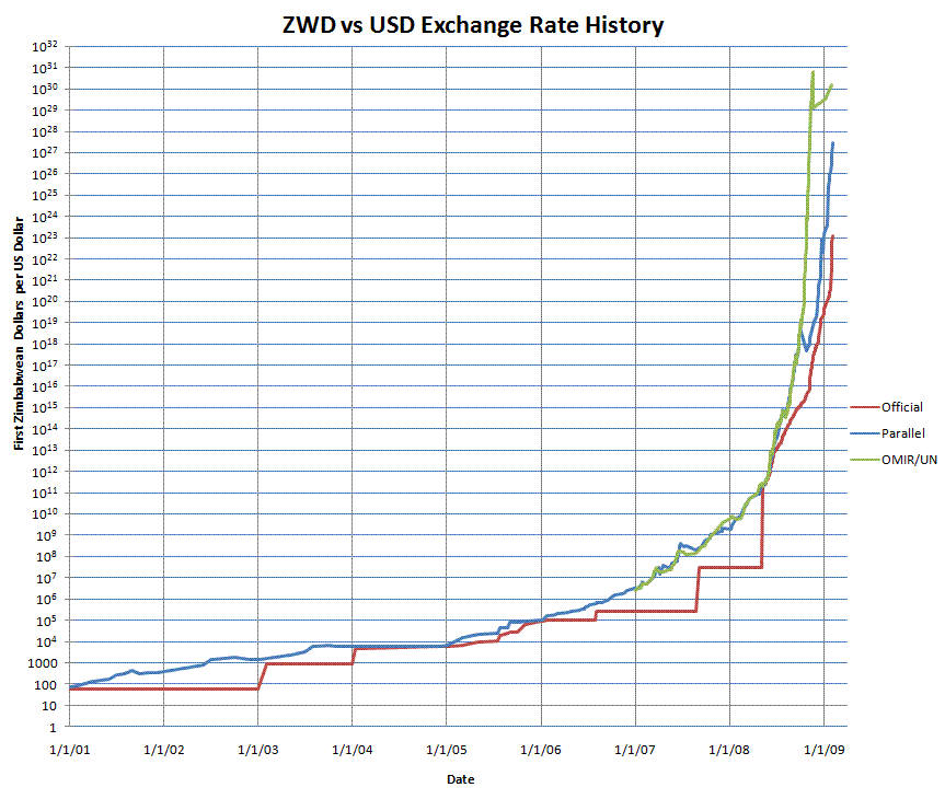
One type of monetary secession results from the fact that there are large differences in the quality of money issued by governments around the world. While many Americans justly complain about the Fed causing inflation in the U.S., the U.S. dollar is a far better product than many foreign alternatives. The Zimbabwean dollar under the control of Mugabe, for example, became a rather poor product indeed. By printing huge amounts of money, the Zimbabwean government removed the scarcity of its currency and made it a next to useless medium of exchange. At one stage, prices were doubling roughly every 24 hours and therefore signalled very little. The graph below shows the path – in logarithmic scale! – of the Zimbabwean dollar’s exchange rate against the U.S. dollar.
[READ THE REST.]
Posted in Chart of the week, It's the economy stupid, Zimbabwe |
Leave a Comment »


